#19: The Size of Countries Relative to Their Neighbors
While this map retains its intrigue, its potential could have been maximized with a more thoughtful execution. The concept is clear: color coding illustrates which countries are larger or smaller than their immediate neighbors. Blue represents countries that surpass their neighbors in size, red highlights comparatively smaller ones, and gray designates situations where this comparison isn’t applicable.
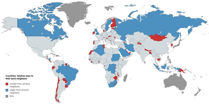
This approach initially helps identify the relative sizes of nations. However, the map’s effectiveness dwindles due to including non-applicable cases, leading to potential confusion as the viewer navigates the various color-coded distinctions.